
Popups serve as an effective tool for expanding email databases, highlighting promotions, and encouraging vital actions on your website. However, not all popups perform the same; there's a stark contrast between the effectiveness of a well-crafted popup and one that's not.
Naturally, you'd prefer your popups to fall into the effective category. This article is dedicated to that aim. We'll begin by offering some fundamental advice on the design and deployment of popups. Following that, we'll showcase examples of successful popups from leading websites and break down their successful strategies. To wrap it up, we'll guide you through crafting your own popup, utilizing these best practices.
Are you ready to enhance your website with better popups? Let’s get started.
Having understood the importance of popup design and observed an instance of poor popup execution to avoid, let's progress to the more positive aspects: the art of creating attractive popups.
Despite some common beliefs in digital marketing, there's no ultimate color scheme that trumps others.
When selecting colors, consider two key elements:
We'll delve deeper into both of these guidelines later on.
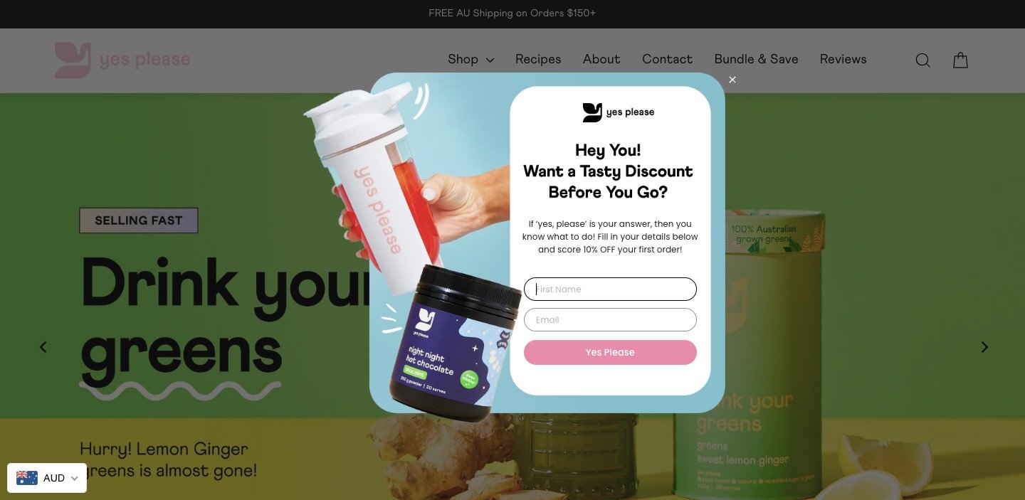
A simple rule of thumb is to opt for a white backdrop or an image, make the background light, and utilize your brand's primary color for headlines and call-to-action (CTA) buttons. This approach is timeless and carries minimal risk.
Take a look at this sample:

Should you choose to incorporate your brand's colors as the background, this approach does more than just coordinate with your branding—it also enhances the representation of your company's values.

With only a brief window to grab attention and spark interest, both your message and design should be straightforward. Be strict in paring down words and design elements in your popup, retaining only what is essential.
Strip down your content to its bare essentials, leaving just a core offer and a call-to-action (CTA). Keep in mind that most visitors will scan just a few words of your popup before deciding to engage further or dismiss it.
Therefore, the visual presentation of your message—including colors, imagery, and overall design—will influence the impact of your popup just as much as the headline itself.
If your popup is focused on specific products, similar to a category landing page, then it's vital to simplify the rest of your content to ensure that the products remain the focal point.
The objective is to select visuals that enhance and complement your text. Opt for high-resolution, authentic photographs of your products over generic stock photos. Sift through your brand's photo library to pick an image that resonates with your campaign's message.
The aim is to select appropriate images that intensify the message conveyed by your text, as demonstrated by this popup:

For seasonal promotions, regularly updating your imagery to align with the current season can evoke a sense of urgency, leveraging the fear of missing out to boost conversions. Even without a specific offer, merely refreshing your visuals to reflect the current season can have a positive impact on conversion rates.
If your product images are appealing and demonstrate utility, visitors are more likely to engage and opt into your email or SMS lists for discounts.
For campaigns like free giveaways, pairing your messaging with visuals that strike an emotional chord with your audience can be particularly effective.
Remember, your popups don't exist in isolation; they're an extension of your website, even when displayed as an overlay. It's crucial that they integrate effortlessly with your brand's aesthetic.
Obvi offers an excellent demonstration of crafting pop ups that are both simple and impactful, aligning seamlessly with the brand's style guide:

This entails selecting components (like fonts and images) that mirror the ones on your website to maintain brand consistency.
Indeed, your popups need to echo your brand's look, but they also must stand out to attract the user's attention.
The CTA should be distinctly colored to differentiate it from the rest of the popup content, ensuring the button is sizable and readable. The headline and CTA typically are the focal points of your popups; hence, they should be contrasted sufficiently.

Different font sizes can be employed to guide your audience's focus to the central message of your popup. You can also use varying font sizes, colors, and other techniques that boost contrast to highlight the primary message.
For websites with darker themes, introducing contrast with your lightbox color can make a significant difference (the gray, semi-transparent area surrounding your popups).

For instance, against a dark blue background on your popup, a lighter overlay can be effective during display.
Alternatively, a fullscreen popup can ensure visibility by covering the entire screen, and using distinct button colors can subtly guide users to the preferred CTA.

Implementing popup design ideas like arrows pointing towards the CTA button can draw further attention. Bright, uniquely styled pointers, or unusual template shapes that diverge from standard rectangles can pique interest due to their novelty.
These unique shapes could be graphic patterns, flowing lines, or even custom figures that resonate with your brand or the theme of your offer. However, it’s important to avoid overemphasizing multiple elements. In the case of a survey popup, for example, opt for a less dominant button style for secondary options.
Aesthetics matter — attractive, site-cohesive popups perform better. Overloading popups with content can be counterproductive; a minimalistic website popup design often yields better results. Clear and immediate closure options are also a best practice; the option to close a popup should never be delayed more than a few seconds.
The success of a popup largely hinges on its timing. Trigger it too soon, and it disrupts the user experience; too late, and you might miss out on engaging potential subscribers. There’s no one-size-fits-all timing — it should be based on when visitors are most interactive with your site. Analyzing the average time spent on your website can guide you to set the popup's appearance at about 60% of this duration.
Relevance is key to popup content. For example, offering a free ebook as someone is about to purchase is off-target and could lead to cart abandonment. Ensure your popup content aligns with the visitor's stage in the sales funnel, presenting sales-driven messages to those closer to a purchase and educational content to early-stage visitors. Popups should also be page-specific to maintain relevance.
The rule of thumb for popup forms is: the simpler, the better. More fields may yield richer data, but they can deter sign-ups. A minimal approach works best for single-step popups, while multi-step popups can gradually request additional details after initial engagement.
No matter how well-designed your popup is, a weak offer won’t convert visitors. Offers need to be exclusive and compelling enough to merit an exchange of information. Consider creating popup-specific offers that aren’t available elsewhere on your site to drive conversions.
Using Plum to design and create modern and practical popups is an effortless endeavor, devoid of any need for technical expertise. One of the most advantageous features is the ability to bypass the creation process from the ground up, thanks to a vast collection of popup templates tailored for a variety of uses readily available in their extensive template gallery.
Furthermore, selecting a template doesn't confine your creativity; there are ample customization tools at your disposal to ensure that the popup aligns perfectly with your site's aesthetics and your marketing objectives.
Don’t hesitate, sign up for an account and experience the simplicity and effectiveness of best popup design firsthand!
Our dedicated support team is always available to help you with any queries or issues you may encounter.
